Thursday, May 5, 2011

Kristine Repcsik

I had the opportunity to experience the production of STOMP at the Merrian Theater in Philadelphia, Pa. on opening night, February 15, 2011.  The lights dimmed, and it all began with one man holding one broom....
STOMP is a unique combination of percussion, movement and visual comedy.  The show was created in Brighton, U.K. in the summer of 1991.  It was a result of a 10 year collaboration between creators, Luke Cresswell and Steve McNicholas.  The show previewed at London's Bloomsbury Theatre. 
The cast of STOMP use very unconventional "instruments" such as brooms, lids, poles, sand, matches and lighters.  One of the most intriguing sequences in the performance was with Zippo lighters.  The cast stood in a line across the stage and started flicking the lighters on and off.  Never would I have thought that such an act could create such a visually stimulating spectacle of subtle beautiful noises.  They seamlessly created different tones and notes such simplistic motions. 
What drives STOMP is its complexity, merging rhythms and building one on top of the other in waves of tension and release.  It creates a kind of mesmerizing,  hypnotic effect on the audience.  The excitement is the collaboration of simplistic everyday objects to create chaotic harmony.  

Tuesday, May 3, 2011

Emma Malikowski

Belle Hollon’s collection of work in the Serpentine Gallery in West Chester is captivating and loud. Upon entering the gallery shared by various other artists, her compositions are arranged first both to your right and left. Her acrylic and oil landscapes are composed on paper with slight paper surface still strategically revealed. Unpainted surface, within “La Canada de Abiquiu” for example, can be distracting if there is too much, however Belle’s way of utilizing this style is fitting and successful. Shadow and light are portrayed with thick, simple, yet appropriate strokes of paint. A closer view reveals a variety of saturated hues arranged in a gestural fashion, creating movement and depth. “View from the Studio” uses exaggerated perspective in a diagonal layout with cool blues and purples suggesting a later evening shadow on the grasslike foreground. 
Although painterly and embellished, each piece conveys a sense of season and time of day. Belle’s application of loud colors, especially in “Red Rock Study: Sierra Negra” is impractical but delightful. A yellow sky allows for a sense of warmth in a contrasting, cool mountainous setting. In relation, “Studio View” depicts tall palm like trees with blue and black strokes before a vibrant orangey red sky. Belle’s use of simple forms still maintain meaning in a stimulating and energetic fashion. While all her paintings are enjoying to view, her larger compositions compliment her bold and unconfined style. Belle Hollon’s collection in the Serpentine Gallery most definitely impacts everyone of all ages. Her works sit behind the counter, allowing for a last glance by viewers exiting the gallery. In all, Belle’s intriguing and untraditional style stands out amongst other landscape paintings, allowing for a long-lasting imprint in the minds of her fortunate viewers.

Sunday, May 1, 2011

Matt Nino


            The opening night for the show “Our Influences” at Serpentine Gallery was pretty exquisite. There were a lot of captivating paintings, drawings, jewelry, and hand built ceramics works.  Belle Hollon’s work struck me as very playful and very loose. I really like the fact that she used strong red grounds to paint over because it helped break apart the usual white of the canvas that shows through on a lot of pieces. Her subject focused mainly on depicting scenes from nature and small rural areas of New Mexico. She had a lot of strong greens and blues amongst many other colors that all worked together very nicely.
The work of John Baker is something that I had never really seen before. He approached things with a ceramic mindset, but instead of using clay or wax he used hand made paper – it reminded me of an advanced style of paper mache. They had really interesting texture and the paper was handled in a very clean and professional way that I would have never thought of.
Gus Sermas’s work specifically caught my eye because in his drawing classes he always emphasized the use of geometric shapes when approaching the composition of the human figure. His use of color in his paintings was also phenomenal, which makes perfect sense because he really knew theory when he taught us color and design. He approached the figure in a very unusual way that not many people understand fully and I thought that was very unique. They were very geometric and fractured figures that were put into environments where the surrounding objects were handled in the same way; which is a great compositional choice because it brings the pieces together not in a singular sense but as a set. The size of his paintings and drawings also worked really well with his compositions. 

Thursday, April 28, 2011

"Carnival Evening" - Henri Rousseau

by Alex Johnson


When visiting the Philadelphia Museum of Art I had looked for a work that had caught my attention not just because I enjoyed how it was painted but also because I had actually felt something while viewing it. Though I had encountered a few works that made me stop and look, the one that stuck with me the most was “Carnival Evening” by Henri Rousseau. At the time, I wasn’t very familiar with his work other than “Sleeping Gypsy.” There was another one of his paintings placed next to “Carnival Evening” (titled "The Merry Jesters") but I was interested in "Carnival Evening" more. At first glance I noticed the coloring of the painting and stopped to examine it some more. I was curious about what was happening in the scene and decided it appeared a bit creepy. I then read the description on the side panel on the wall that explained the subjects and the scene of the painting, which gave it an eerie feel.

"Carnival Evening" Henri Rousseau. Oil on Canvas. 1886. 

The painting shows two dark figures dressed in carnival outfits, the man looking almost like a clown; the woman in a dress with a cone shaped hat, standing in a dark forest. Their faces are difficult to make out completely, however they seem quiet and sad, unlike the joy one would expect to feel if having just been at a carnival. The sky is a dark indigo color with a bright moon and gray clouds at the bottom.  The description on the wall mentions how the light from the moon somehow leaves the forest in darkness, and the figures are glowing from within. Even though this use of light wouldn’t be true in real life, it works in the painting as it adds to its mysterious feel. To the left of the figures, there is what seems to be a floating face. I didn’t notice this face at first, I saw it only after reading the description that states “an unexplained face leers out from the empty hut beside the figures, and an unexpected street lamp incongruously grows nearby.” I still can’t find the street lamp but the random floating face is what also made the painting feel eerie. The figures are isolated and seem somewhat lonely, even though they are together. Overall the scene is very quiet and seems as though there is danger lurking. 
            I wanted to learn about the meaning behind the painting but I couldn’t find much online. However, not knowing the definite meaning and reasons Rousseau created this painting adds to its mystery. While researching I've discovered his other paintings and have noticed his subject matter involves a theme of fantasy that isn't completely straying away from reality. Also while reading online I learned how his art wasn’t taken seriously and often ridiculed. Mostly this was due to his “childish” style, however I feel as though his style works well with his paintings because of their themes. I enjoy the fantasy aspect of his work since it provides the viewer with something to wonder and think about when viewing his paintings, such as the story they are trying to tell, rather than just looking at them and walking away. This makes me appreciate his work even more, especially "Carnival Evening," since not only is it painted well but there is more to it than just the paint on the canvas.

Wednesday, April 27, 2011

Caught in the Water Mill, By Juliana Noone


Walking through the PMA the morning of our field trip on February 6th was much like any other time I’ve visited an art museum.  I find myself ambling from room to room channel surfing the artwork on the walls, pausing from time to time to linger over one or another that catches my interest. That morning, however, a painting grabbed a hold of me in a way I haven’t quite experienced before. Walking through the European section on my way to Modern Art I was stopped by Frits Thaulow’s Water Mill. The painting is a trickster. At first glance it looks like a painting of pretty much nothing but water, and it was how well he rendered the water that caught my eye at first, but then it sucked me in. I feel as though I was hypnotized by this painting, and I mean that as no exaggeration. In fact, when I finally tore my eyes off of it Emma said to me, “Wow, you were, like, really into that,” which, to me, was quite an understatement. I walked away from that painting to check out the modern art, but my mind was preoccupied with the Water Mill and I found myself right back at that painting for the duration of our stay there.
The painting is set up in a layer cake composition, but what makes it so hypnotic is that it is also layered towards you, the viewer. Submerged beneath the rippling top layer of the water’s surface are layers and layers of color that loosen and soften as they recede, giving the effect of actually looking into a pool of water. The predominately green center line of the composition is piled with the most layers making it the most in focus. The rendering of the water is tight and detailed with thin swooping brush strokes. The paint becomes thick and textured as it gets closer to the churning water beneath the mill. The strokes become tighter, yet, and more energized and chaotic. The frothy white lines bring your eye to the blue foreground where Thaulow’s strokes slowly loosen and relax. The water calms as it approaches the foreground. It becomes soft and more peaceful, creating a beautiful juxtaposition with the churning water above. After relaxing in the foreground for a while your eye gets pulled back through the currents and to the focused middle layer again, where the churning of the mill sucks your eye to the window between the buildings and launches you into the background. My first impression of the red brick buildings was that they were not nearly as intense or strong as the water in the middle and foreground. Then as I stared at them, the layers broke apart and the painting united itself as the mottled undertones of the buildings emerged and mirrored the soft under layer of the water below.
The relationship of the compositional vertical layers of the painting and the literal layers of paint piled on the canvas creates a mesmerizing marriage of colors. I spent over a half an hour of our time at the museum being pulled up and down, forward and back by the currents of the painting. I felt like a piece of debris at the base of a waterfall. It wasn’t until I got tossed around every inch of it that I felt comfortable walking away. I researched the Norwegian Impressionist painter when I got home and found that his specialty is landscape, and he is no stranger to depictions of hypnotic water scenes. The energy of his brush strokes and his handle on movement and lighting shows his understanding of Impressionism. I would like to get a chance to see more of his work, if only to see if it grabs me as intensely as his Water Mill did.

Franz Kline's "Torches Mauve"


 Franz Kline’s “Torches Mauve”

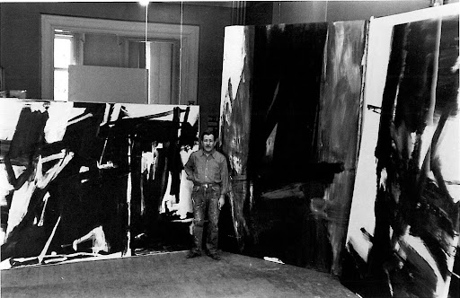
            “Torches Mauve” has an extremely powerful presence in the Abstract Expressionist room at the Philadelphia Museum of Art.  The vertical canvas stands 10’x6’ forcing the viewer to look up and see Kline’s majestic brushwork.  The painting consists of roughly three dominant colors black, white and mauve (hence the title of the painting).  The colors are mainly very saturated, out- of–the-tube colors except when the purplish color gets mixed with the whites and blacks.  Color was not particularly common for Kline and much of his work has a very graphic quality consisting of strictly black and white paint.  The painting was done in the year 1961 towards the end of Kline’s life when he started introducing color back into his paintings.  The title of the painting comes from the name of his friend Joseph Torch.  Torch owned an art store in New York City and sold Franz Kline various paints, including the color mauve used for this painting.

            Franz Kline was born in 1910 and reached the height of his career around the 1950’s.  Like many of the Abstract Expressionists Kline painted landscapes and other subjects from life before turning to abstraction.  He is most well known for his enormous black and white paintings, which contain multiple turbulent strokes of black paint on a white background.  The black masses in Kline’s paintings were influenced by the dark shadows in the paintings by El Greco, Rembrandt and Velazquez, as well as the graphic prints by Goya, Daumier and Durer.  Kline actually produced many of his paintings by carefully projecting small sketches onto huge canvases.  He would then fill in the dark areas with thick black paint often referencing industrial landscapes, bridges, railroads and many other products of the Industrial Revolution.

            “Torches Mauve” was a later work of Kline’s.   Flames came to mind when I viewed the painting and the fact that he uses the word “torches” in the title may suggest a burning structure of some sort.  I was immediately drawn to the huge vertical black mass in the center top ¾ of the painting.  The black mass contains two angular patches of purple color, which drew me in further.  After seeing the black mass, I turned my attention to the left and right and was engulfed by the frenzied brushwork with the purple/mauve color.  With or without color, Kline’s paintings have immense power.  The verticality of the piece makes it even more intense to look at, and being in its presence is a very overwhelming experience.  Franz Kline was known to paint with brooms in order to cover the large areas as quick as possible.  The spontaneity of painting to capture emotion was a very common practice among the Abstract Expressionists.

            Overall, Franz Kline’s paintings may seem very simple but like any great artist, a lot of work over many years gave Kline the confidence he needed to execute such beautiful paintings.  “Torches Mauve” is just one of many great works to come out of the Abstract Expressionist movement as well as Kline’s personal oeuvre.  The simple but intense color scheme and large masses of black and purple exude strong emotion from the painting.  This masterpiece is something that deserves to be viewed, in person, by everyone.  


Tuesday, April 26, 2011

Endevours of Duchamp by Kacie Murray

I can remember visiting the Philadelphia Art Museum as a little girl. Like most things, it appeared so much bigger then. It truly was a castle where my dreams were inspired by rooms filled with knights in shining armor, and ballerinas casted in bronze. I remember most things, but I don't know why I don't remember the modern and contemporary section at all! Maybe my parents never brought me in there, or maybe at the time it seemed like paintings I could have done myself and simply dismissed it?  To me these works are like taking a deep breathe of fresh air. I will admit that I felt a bit left out when everyone seemed to be buzzing over the Cy Twombly room (but i appreciate the way it makes me feel so small in a world full of wars and evolving peril). There is so much, though, that I can fall madly in love with and stay and watch in amazement as if watching "The Wizard of Oz" for the first time. Such as favorites include Dorthea Tanning's Birthday and Henri Matisse's Breakfast, they are the pieces that make me want to be a better artist.

This particular trip I seemed to spend alot of time looking at Marcel Duchamp's work. Duchamp himself was quite unconventional and was known to challenge the artistic ideas of the time. He was mostly associated with the Dada movement. Dada itself was a movement that began in Zurich, Switzerland amidst World War I. The art itself was mostly statements that expressed anti-war sentiments and made art that challenged cultural norms and intellectual boundaries. They are responsible for the development of some of my favorite art techniques including collage, photomontages, assemblages, and readymades. One of the first readymades was made famous by Duchamp when he called a urinal art and named it Fountain. That is a perfect example of Duchamp's intellectual mind play, he is immediately challenging you, evoking instability, and questions to be asked. He was opening minds, not necessarily to understand the art itself but to the reaction they had to it.


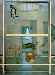
It wasn't until this trip that I had even noticed The Bride Stripped Bare by Her Bachelors, Even. Initially my attention was captures by the broken glass. I sat down at the bench right across from the piece and tried to absorb what I was looking at. Initially my brain was trying to decipher the sumbolism behind the endevours of painting those mechanisms and the metaphors he meants for them to carry through to the viewers. Then of course I'm going back to what initially sparked my interest which were the huge cracks in the glass. Why were they there? I was immediately bombarded with questions, of course. Though provoking is what comes to mind when I see this work of art, as well as most of Duchamps work. It is, to me, one of the most successful things an artist can do for their viewers and something that I am currently striving for in my own work and will probably continue to do for the rest of my life.

Tuesday, April 19, 2011

Drew Jordan experience by Brent Rakus

                                    
    While walking through our own Mitchell Hall I immediately dropped my bucket of jolting metal and sped to the McKinney gallery.  This draw was to the hemorrhaging serpent like metal construction, seemingly bursting through the wall.  The work’s name, “Inflection”, the sculptor, Drew Jordan.  “Inflection” consisted of spiraling aluminum and brass that slipped right up to two well-placed mirrors on each end of the sculpture.  This mirroring effect doubled the space, and completed the sleek lines of this design.  It almost gave me a frightening emotion, most likely from years of watching movies of artificially intelligent robots taking over the world!  Upon closer inspection, the true talent and  workmanship of Jordan’s metal working created a flawless almost surreal nature to the piece.  I thought to myself, “This would be a good moment to move away before this thing starts moving on its own.”  Incredible.
    While making my way around the gallery, it became apparent that Jordan’s diligence in his studio practice could be seen in a wide variety of mixed media.  Free-flowing objects of wood and metal created harmonies lines that drew me in to each of Jordan’s pieces.  His technique of steaming wood to bend it, and later shaping the metal to it, manifested a feeling of unity and togetherness. The wonderment of two objects, so different in nature, portrayed as though they never were apart, intrigued me.  Jordan’s use of torn canvas painted red on his backgrounds pushed the dimension through contrast, and emphasized the negative space.  Again, interested in his construction, I noticed each one of these canvases was actually meticulously stitched in with metal wire.  Being in construction from early childhood and creating 3d mixed media myself, I was very inspired by the use of building materials, such as broken concrete.   I thought to myself, “Where could that have come from? What was its purpose? And why did it fail?”  I later found out Jordan shared some of these thoughts about the history of his found objects.  I needed to know more about this artist.
    Upon researching Jordan’s website I noticed some similarities.  He too went for his BFA right here at WCU, and worked in a metal shop like me to improve his skills.  Of course it was a more intense shop consisting of steel fabrication, torch cutting, and MIG/TIG welding.  Jordan worked his way up to foreman and gained permission to use the shop space and metal scraps to continue his passion for art.  Jordan later apprenticed under Kerry Rhoades owner of Forged Creations, a blacksmith shop in Delaware.  This led Jordan to open his own design build shop in Delaware called Jordan Sculptures.  I look forward to visiting his shop soon and seeing more of his amazing sculptures. Jordan’s work was definitely a big inspiration to me, I just hope I didn’t get too close and smudge his work with my nose. 

Dear Drew Jordan, please let me use some of your big bad boy tools--artist in crime Brent Rakus.


Monday, April 11, 2011

Van Gogh's Rain

by: Claire Hudson

Vincent van Gogh, "Rain", 1889, Oil on Canvas

The rain slaps the window and patters to the field below, as the sky billows-- a steely gray blanket. You feel cold, but thrilled at the passion of the rain as it beats down from the sky. This is a moment that will last only as long as the storm itself, but is forever captured in Van Gogh’s 1889 painting Rain.

The ability to capture the emotion of a moment is one that is immensely hard to attain; as artists, it is an ability we all covet and wish to utilize. Van Gogh does just this through his application of paint. What is so striking to me about Van Gogh’s Rain is the passion of the strokes, and the gentleness of the colours. Van Gogh’s brush strokes appear so quietly aggressive, that I felt slightly taken aback at being drawn in so close. The ferociousness of the rain paired with the overlapping blues, greens, and pale yellows, create a stunning juxtaposition conveying an unease that is appealing and difficult to ignore.
 
Compositionally and technically, Van Gogh utilized line like no other. In Rain his use of dashes, hatches and long strokes work to move your eye around the composition, from the right top corner to the bottom left and back around. It is interesting that such a monochromatic painting, with very little in the landscape itself, can have so much swinging, circling movement.  Upon first look, I found myself tossed around the painting by the wild lines and marks. Once I had observed the painting further, I noted the carefully placed yellows in the left foreground and right background that act as anchors in the sea of cool greens and blues. One would think from all my word choices--aggressive, wild, swinging--that Rain is a stormy scene of turmoil. However, the softness of the colours create a buffer that mutes the turbulence.

Perhaps, as Rain was created during Van Gogh’s stay at the clinic of Saint-Paul-de-Mausolee, this is what the mind of a troubled man looked like. However, the delicate colour choices and gentle overlapping make me think otherwise. This was a work of a painter in love with contemplating and creating. How else could the sound of the rain, or the feel of the wind, be so carefully and strongly conveyed to the viewer. When I view a Van Gogh I do not see the landscape, I simply feel the intensity. He was truly an expressionist, and his emotions were so honestly put onto the canvas that they are impossible to miss. Normally I am drawn to brighter and lighter paintings, like Monet’s Marine View with a Sunset, or Cezanne’s Winter Landscape. However, the power of his lines and the suddenness of the captured moment make Van Gogh’s Rain my top pick from the Philadelphia Museum of Art.

Saturday, April 9, 2011

"Water Mill" by Corey Johnson

           During my visit to the Philadelphia Museum of Art there was one painting that in particular caught my eye and desire to look into more.  The painting was titled “Water mill” by Frits Thaulow, and was painted from 1847 – 1906.  The scene depicts an early 19th century water mill from across the waterway.  The painting is beautifully done with careful tight brushstrokes near the surrounding buildings and mill in order to show the current of the water.  As I gazed into the painting, I could see that Thaulow loosened his brush strokes the further he painted them away from the foreground.  This helps give the viewer a better understanding of how the tide of the water was flowing and make the painting look realistic.  Thaulow uses a combination of blues, greens, and whites to vary the waterscape of the painting.  While carefully showing the movement of the water, Thaulow also considers the reflection of the sky in the water as well.  Keeping dark teals, blues, and greens, up close in order to show the shadow from the buildings.  Then loosening up the colors quickly where the sun is shining into the waterway.  One can make out a clear indication of where the sun is hitting the water and the path it takes as it leads your eyes across the water towards the mill. 
            After studying some other works by Thaulow it seems as if he has interests with realistic painting, while incorporating impressionism through his brush strokes, to loosen the flow of the water and other aspects in his paintings.  Thaulow is from Norway and is characterized as an Impressionist painter with the ability to create natural depictions of landscape.  This particular painting was done with oil on canvas and was most likely painted somewhere in France.  Thaulow moved to France in 1892 after becoming bored with the landscapes Paris had to offer. 
            This particular painting caught my attention enough to further look into it, not once but three times.  I just had to keep coming back to it.  No matter how or where I observed the painting it worked.  From a distance it looks like a photograph except for the buildings in the background.   Up close it still looks real, despite the individual brush strokes that one can see.  Personally I think I enjoyed this painting because of my fascination with water and waterscapes.  Water is so beautiful to look at in nature, especially with the sun and sky’s reflections showing on the surface of it.  Thaulow captures that and more in his paintings and has become one of my new favorite painters to observe.             
            All in all, the trip to Philadelphia was a great success.  It was a long and tiresome day, but very beneficial.  I enjoyed the whole trip and wish we had more time to do other trips like this one.